
Whether you’re a man who doesn’t shy away from creative colour combinations, or you’re happy to keep it classic in monochrome, there’s no doubt that colour can play an important role in the vibe you give off to the rest of the world. That’s why it might be good to steer away from what has been dubbed the ‘World’s Ugliest Colour’.
Pantone’s 448 C, or ‘opaque couché’ is pretty putrid and has been described as ‘dirty’, ‘tar’ and even ‘death.’ Sounds like a pretty bad rap for just a harmless hue, but this colour actually has an important mission.
Experts actually chose the deep khaki colour to discourage smoking. Apparently, one look at this colour will convince of its habit-breaking abilities. In fact, in 2012 the Australian government hired research agency GfK to spearhead the new package design for all tobacco products with the aim to make every carton look as unappealing as possible.
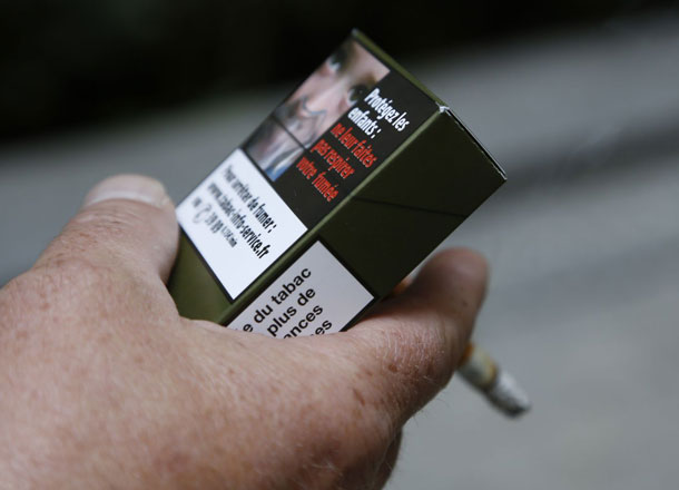
After 3 months, 7 studies and more than 1000 regular smokers, researchers picked a ‘drab dark brown’ hue strikingly similar to ‘opaque couché’. Other options for the packaging included lime green, white, beige, dark grey and mustard. Dark brown came in at a close second but was ditched last minute for its rich, and chocolatey appetising undertones.
Since then, Ireland, the UK and France have passed plain packaging laws of their own, with mockups featuring the same hue. As for all the ‘opaque couché’ gear in your wardrobe? It might be time for a refresh.
[via HouseBeautiful]
 1/1
1/1